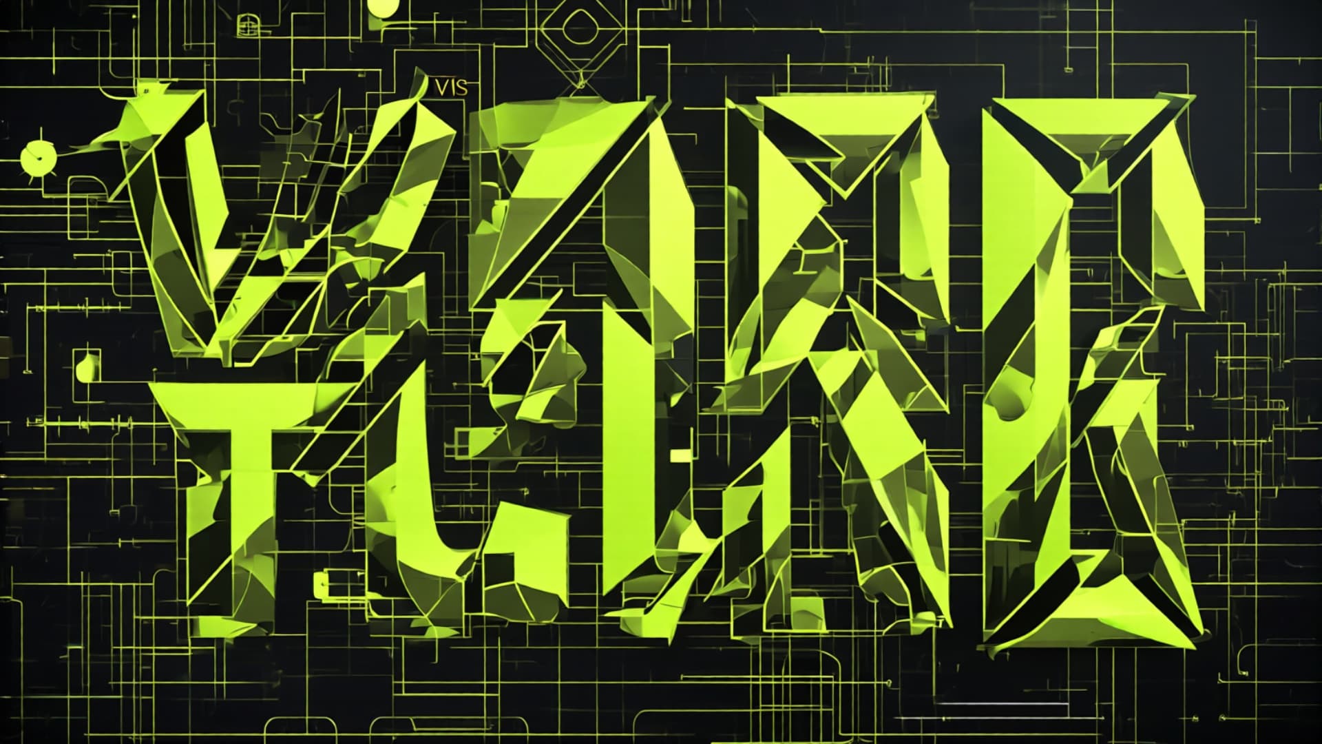

Most SaaS platforms look the same. Gradient heroes, rounded cards, Inter font, three-column layouts, glassmorphism. We didn't want that. We wanted something that felt like a terminal — industrial, precise, unapologetic.
THE CORE RULES
- 0-2px border radius — No rounded corners. Sharp edges everywhere.
- One accent color — Lime green (#d2f800). Used sparingly for maximum impact.
- Uppercase headings — Geist Sans, font-black, tracking-tighter. Bold and architectural.
- Dark backgrounds — #080c14 primary, #0f131c cards. No white surfaces.
- Monospace accents — Code comments as section labels.
{"// HEADER"},{"// FOOTER"}. - 4+ layout families — No repeating patterns. Each page earns its structure.
WHAT WE AVOID
The "AI slop" checklist:
- ❌ Gradient heroes
- ❌ Three-card layouts
- ❌ Glassmorphism
- ❌ Inter font
- ❌ Placeholder illustrations
- ❌ "Insights," "Growth," "Scale" — vague labels
THE RESULT
A design system that feels different. Every Boottify page is recognizable — not because of a logo, but because of the visual language. Dark, sharp, monospace, lime. That's the brand.
79 hardcoded colors are now CSS variables. Change the accent from lime to amber, and the entire platform shifts. That's the power of a tokenized design system.

